Names
1. Guernica, by Pablo Picasso, 1937, oil on canvas, Reina Sofia museum, Madrid.
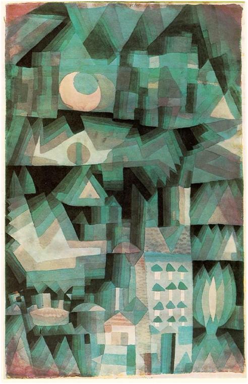
2. Dream City, by Paul Klee, 1921, watercolor and oil, Private Collection.
3. Two Women, by Joseph Fernand Henri Leger, 1922, National Gallery of Art, Washington, D.C.
4. Still Life with a Beer Mug, by Joseph Fernand Henri Leger, 1921, oil on canvas, the Tate, UK.
5. Eptinger Eteint, by Herbert Leupin, 1948, France.
6. Don’t feed black market greed : pay no more than ceiling prices, 1946, Office of Price Administration, US.
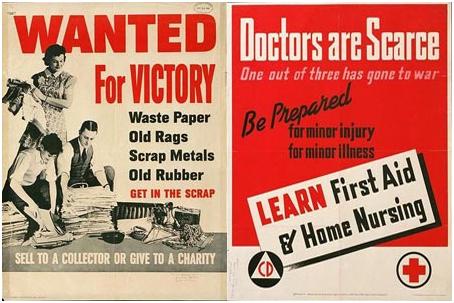
7. Wanted for victory : waste paper, old rags, scrap metals, old rubber : get in the scrap, 1942, by the Office of Production Management, US.
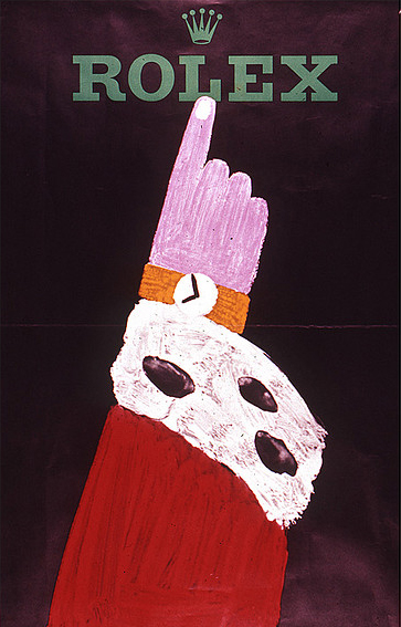
8. Rolex King, 1959, Herbert Leupin, Wolfsberg, Zurich.cm. 90 x 128
9. Der Kluge reist im Zuge (the smart one travels by train), an SBB (Schweizer BundesBahn) train company poster, 1950s, Switzerland.
10. Wire’s Pink Flag, 1977, Harvest/EMI, UK.
11. Kraftwerk’s The Man-Machine, 1978, Capitol, UK.
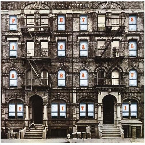
12. Led Zeppelin’s Physical Graffiti, 1975, Swan Song, US.
13. Neil Young’s’ After the Gold Rush, 1970, Reprise, US.
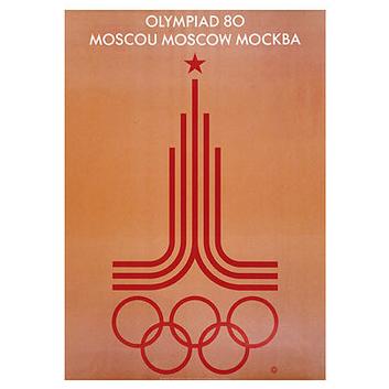
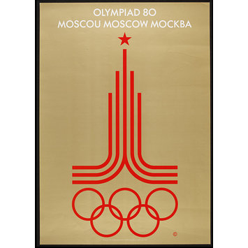
14. Olympiad 80 Moscou Moscow Mockba, 1980, Moscow.
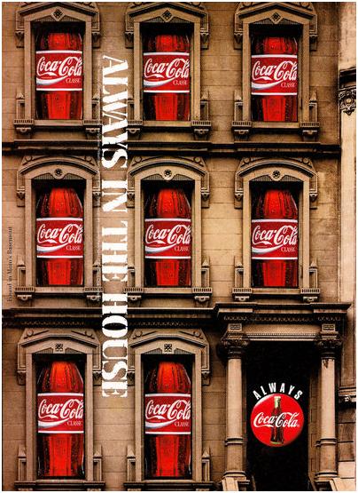
15. Always in the house, 1990, Coca-Cola.
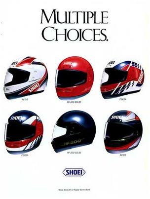
16. Multiple Choices,1997, Shoei.
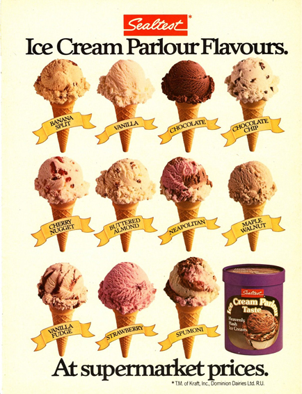
17. Sealtest Ice Cream Parlour Flavors, 1980, Sealtest.
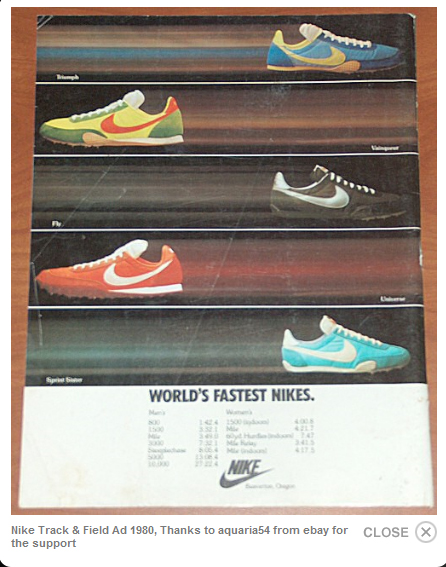
18. World Fastest Nikes, 1980, Nike Track and Field.
Notes
1. Lack of color makes the ambience dark and sad, and the composition is confusing and chaotic – the painting is very successful at depicting the destruction of Guernica during the Spanish Civil War.
2. Soothing colors all close to each other gives a feeling of transparency to the image, making the city look very dreamy and foggy. The was was over, and peace and tranquility was being regained by citizens around the world.
4. Lots of color contrasts between black and white, or use of primary colours is very useful for the simplistic vision (even if there are gradients and shadings) of the everyday life, after the war, when everything went back to normal.
7. Limited use of color (red, black and white) made the posters look more serious, almost authoritary and people took them more seriously. They were also quite punchy and the images were much less important than the message with the big fonts (the typography is very well chosen).
9. Minimalistic design of the character (a style of drawing quite popular at the time – UPA) in color contrasts a lot with the black and white background. Also, the fact that the back is made of a common train schedule contrasts with the rich fancy aristocrat. Anyone could travel by train, regardless of their economical situation.
10. Very cool design of very contrasting colors and shapes (1 line, 3 planes of different sizes and forms) makes for the band’s name (the only typographic element in the image) very clear and important. The name of the album is not there but it can be easily guessed by the image (a pink flag). At a time where punk/rock music was quite popular, bands needed to make a statement, and the Wire was strong on anthems and simplistic songs. Youngsters followed them.
12. Repetition and word fragmentation. A very imposing building with every room occupied relates to the young people at the time, who were rebellious and wanted to be independent, and left home to new cities to live in flats and live their lives. There is a party in that dark sad building and it’s organized by every red letter of the title and the band that made that album.
14. Minimalism with a key color palette make the Moscow Olympics poster very interesting. The country had invaded Afghanistan at the time and was being boycotted by many countries, its political approach, obviously depicting the Soviet Union’s colours and characteristic star, made it look like the country was true to itself and proud of it’s actions.
17. There’s a lot of repetition in this poster. The many different ice cream cones show you all the flavours Sealtest has, only the true message is that now they sell the ice cream at the parlour also at the stores. The message is quite clear.
18. Repetition also, Nike is already an extremely popular brand and it shows fast shoes, I guess the shoes are inverted to give balance to the picture. The blurs behind the shoes make them look unstoppable, and that’s what teenagers aching for popularity need to be the stuff at school.
References
http://en.wikipedia.org/wiki/Pablo_Picasso

http://www.artinthepicture.com/paintings/Paul_Klee/Dream-City/
http://www.internationalposter.com/poster-details.aspx?id=SWL00139
http://www.swissworld.org/en/switzerland/swiss_specials/swiss_trains/background/
http://digital.library.northwestern.edu/wwii-posters/
http://pitchfork.com/features/staff-lists/5932-top-100-albums-of-the-1970s/

http://oldmagazineads.blogspot.com/2007/11/1980-sealtast-ice-cream-ad-print-photo.html